View Project
Read More

Improving safety measures is critical to organizations. A key outcome of Universal Design is that it minimizes hazards and the adverse consequences of accidental or unintended actions. Although there are many ways to reduce hazards in the workplace, here are five ideas that you should consider.
Almost 80 percent of accidents in buildings and on campuses occur on stairs. That’s an amazing statistic when you consider that these vertical movement elements are so common in our lives, and that building codes devote so much attention to stairs. When someone trips, gravity is working against them on a stair. In addition, many people pay more attention to their cell phone than looking where they are going.
To promote a safer stair, Universal Design strategies use visual and tactile cues. Stair treads should be in a contrasting color to floors and landings, and the tread nosing should be slip resistant and in a contrasting color to the tread. Try using a tactile finish on the portion of the handrail before descending or ascending the individual steps. Use a tactile flooring material at each floor landing which provides a cue that an elevation change is about to occur. And lastly, eliminate any reflective or veiling reflections from light sources ensuring that the stair is well lit.

A question that should always be asked early in the design phase is “what about a ramp instead of stairs?” This is not typically looked at because it’s not mainstream thinking, but consider this; a ramp is a deceptively simple solution that embraces all users, accommodates people at different speeds, promotes equality among users, and is far safer than a stair. Your organization would make a powerful statement supporting inclusivity if you had a ramp as the main source for vertical circulation.
I like to say that there is not a ninety-degree angle on the human body. Much of the furniture manufactured in the past and present provides for a sharp, simple corner which is primarily due to ease of manufacturing and cost. In plan-view on the documents, the pattern of crisp corners looks good, but it’s an accident waiting to happen. Styles are changing, and I have seen more tables, workstations and countertops that are easing this unforgiving condition. Adults bump into these corners often, but toddlers are exponentially more prone to injury because of their activity level, and at certain ages, their head is in perfect alignment with such corners. Specify rounded corners on your designs, and you will find it is a friendlier and safer place to be.
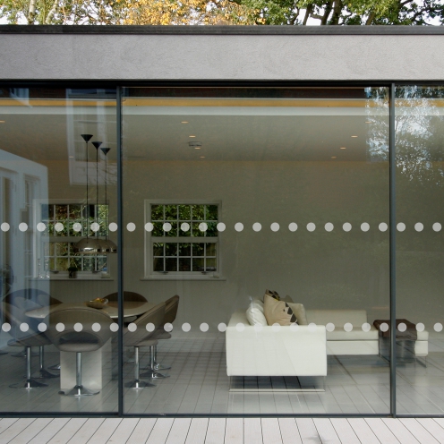
As designers we love transparency. We also need to understand that there are many individuals who may have a visual impairment or others who may not be regularly exposed to this design element. When using glass, minimize accidents by placing visual warning graphics (decals) at two locations. Check your local code, but they are typically positioned at about 32 inches and 60 inches above the floor, and in a repetitive horizontal pattern. This simple practice makes the glass more visible for young people and seniors, people of short stature, tall people and even pets.
OSHA defines a trip hazard as “a trip resulting from an obstacle or an uneven surface.” Trips are among the most common causes of accidents at work. A person who is moving through a space usually trips because of not paying attention and/or there is something they would not reasonably expect to encounter, such as uneven stair risers, an uneven transition between two flooring materials, or thresholds at doors that are too high.
Designers should meet with contractors before the start of construction and communicate that all floor finishes are to be flush with each other—no exceptions. Exterior door thresholds, if any, should not exceed one quarter inch in height, while interior doors should never have a threshold. In addition, good design should provide for no electrical cords or fixtures to encroach on egress routes or common paths of travel.
It’s easy to understand why many building entrance slips and falls occur between the hours of 8am and 10am. People are typically entering the facility at a concentrated time, in a hurry, and often during inclement weather. Next to stair accidents, slipping as you enter a building is another regular occurrence, and most often attributable to wet conditions or polished flooring surfaces that look nice but don’t allow for adequate friction. Providing surface rugs helps, but also creates trip situations at the rug perimeter and as it can bunch up. Design a large enough, recessed walk-off mat that is flush with the surrounding floor material while allowing water and dirt to collect below it. This provides for a comfortable, surefooted surface that helps eliminate wet, slippery floors caused by tracked-in dirt, water, and other debris. Any other flooring adjacent to the walk-off mat should be specified at the appropriate slip-resistant coefficient of friction (COF). The recessed option is a bit more expensive, but well worth fewer accidents and the safety of employees.
Universal Design is the idea that a campus, building or product, can be created in a way that makes is more usable and safer for a diverse range of people. Taking the initiative to address these five items, will support a space that is friendlier, safer, and more productive for all.
